That Cement "Tank" Wagon
Reviews of modern model railway vehicles often refer to the quality (or otherwise) of the Tampo printing. Some reviewers erroneously call it "Tempo" printing.Tampo is a brand name, like Hoover, but the technical term is "pad" printing. And here is a "pad" printing machine.The green bits are the pads and there are four of them. That means the machine can print in full colour using the four standard tints, Yellow, Magenta, Cyan and Black. Like the "offset" sheet printing principle, the pads pick up the inked design from an engraved plate and splodge the design onto whatever is being decorated; with a logo, a picture or the design on an OO tank wagon.
The clever bit is that the pads are a bit squidgy, so the design can print on uneven surfaces. Here is one doing it.Designing the plates is the clever bit (adjusting the image so it produces the right shape on the irregular surface!), plus adjusting the height that the pad descends to, so as to match the thickness of the "target" part.
Modern "Tampo" machines can be designed to be exceedingly accurate offering minute detail on the finished product
In essence, that is how the superb quality of lettering finds its way on to a modern model.
Dashed clever these chinese.
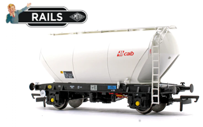
fbb's latest wagon is all-over white; but the tank body does have some small snippets of detailed artwork.
And the chassis, as well as all those coloured pipes and valves, has lots of minuscule, but readable "Tampo" printing ...... whatever the labels might mean!The black on blue label almost defeated fbb's not very expensive phone camera ...... and this panel of instructions was beyond even the Tampo technology!Even the little arrows on the brake wheel are clear to see (with the help of the camera!)The general level of detail is exquisite, as here on the ladders.Note the extra handrails, the change from rungs to proper steps at the top and the electric overhead warning zot. The axle box detail is fascinating as well.In the box, as well as a brief history of the real wagon, you get an "exploded diagram" of all the parts.Some of the extra "ticks" on the sheet are where fbb attempted to make an accurate count of all the parts that have been assembled into this wagon.
He kept losing count but the total is OVER 100!
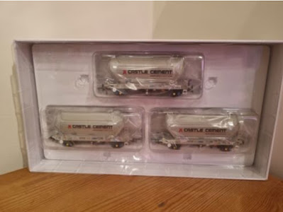
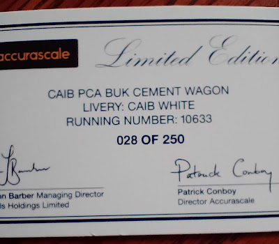
It makes the high price seem cheap! Cunningly, Accurascale (retailer of the wagon, made in China) only sell these beauties in packs of three ...... at about £77 per pack. Frankly, fbb would have preferred a cement tanker with a bolder company name on the side, but would have no use for the two unwanted models in the set of three. So his singleton was a slightly more expensive "limited edition" for Rails of Sheffield.Things have certainly moved on a bit since fbb's early modelling days!
NBC At 50 - Nostalgia Blues?
NBC At 50 - Nostalgia Blues?
We tend to think that the National Bus company specified that the vehicles should either be in Leaf Green or Poppy Red. But in the very early days, blue was an option.
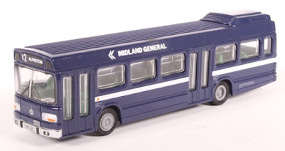
fbb was familiar with Midland General ...... using a shade similar to their pre-National Bus Company blue. But this was NOT the "official" NBC blue. Or was it?
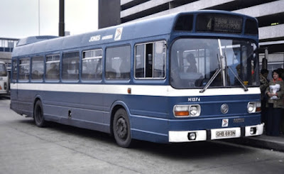
fbb had forgotten about Jones of Aberbeeg,The current issue of Buses Magazine includes the above picture with the caption suggestion that Jones was the only company to use the official National Bus blue. In the above snap it looks very much like Jones' original livery blue ...... but on other pictures it looks darker like Midland General.Colours are always subjective and blue was a more difficult shade to capture in colour.
Java High Speed - A P.S.
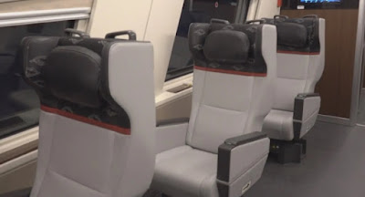
A look at First Class luxury. Wide gangways, lots of leg room and wide seats. Wow!But, for some, NO WINDOW! Aaaaargh!
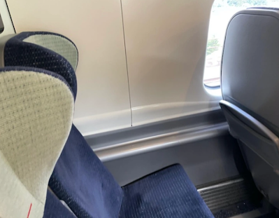
It is just the same on a refurbished Avanti (First Rail) Pendolino.It is hard to believe the company's contention that some passengers actually prefer to gaze out onto a chunk of buff-coloured plastic!
The Passing Of Powell's
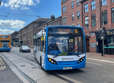
Well, at least they tried! This was their branding for route 6.Pink buses and bright branding - they certainly did try. Now Stagecoach have taken over "the six" after Powell's demise, will we expect such enthusiastic marketing? Too early to say, but fbb thinks not.Stagecoach have abandoned branding nationally and locally in favour of boring!
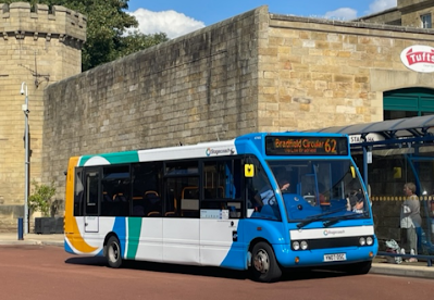
Recently, on the ex Powell's 61 and 62 circulars from Hillsborough "interchange" (don't laugh), you had a choice of old ...... or new Stagecoach standard.Pictures from correspondent Roy - many thanks. Powell's livery was, at they say, different.
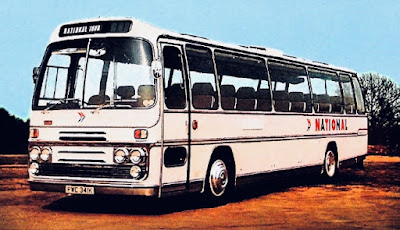
Sadly, basic white always looks unfinished.Which brings us neatly back to National Express of 50 years ago!
It always looked as if it were in undercoat and awaiting something brighter!
P.S. A Picture of the Peterville Pug
It always looked as if it were in undercoat and awaiting something brighter!
P.S. A Picture of the Peterville Pug
Yesterday fbb reminded his loyal readers that he possessed a Dapol Pug as a static model, usually displayed on the platform of Peterville station.
Tomorrow, we go to Newbiggin on Lune
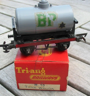
A nice simple model, a bit crude perhaps, but in the quarry's blue livery it makes a useful "exhibit" for the OO scale visitors!
Maybe, one day, fbb will buy the Hornby working model.
Next Rural Minimalism blog : Tuesday 16th August



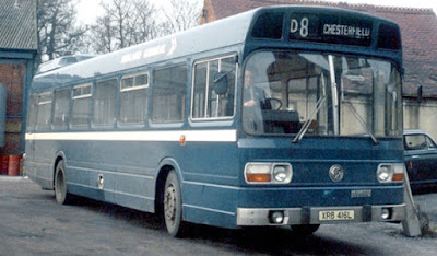

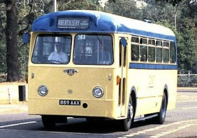





TM Travel also used route branding for the 6 before they lost the contract to Powells - given that Stagecoach have stepped in at the last minute you can't expect them to have drawn up branding, had it approved by whoever needs to do it and then apply it to specific vehicles.
ReplyDeleteNBC clearly did have an "official" shade of blue - it was used for four of the letters of the word "National" on the white coaches! However, I am reasonably sure that there was not an "official" blue for bus liveries - or, it was not widely used.
ReplyDeleteThere is a preserved Midland General Leyland National that is, as I understand it, painted in a shade that was intended to be NBC standard blue. However, the "blue" companies generally used their traditional shades of blue, but with NBC corporate style white relief. In the case of East Yorkshire there were two shades, since dual purpose single deckers used a paler shade than was used on double deckers and single deck buses.
Jones of Aberbeeg continued to use blue for ten years after the takeover by NBC, and it is generally agreed that this had been a condition of the sale to NBC in 1969. The shade of blue used was the same as had been used prior to the introduction of the NBC standard liveries.
Yes, given the standardisation of the NBC corporate identity it seems odd that there was such variation whenever blue was involved.
ReplyDeleteI think Jones initially continued to use their own traditional shade (to NBC layout) but later this changed to a British Standard (BS) shade that was the same blue as used on the lettering of white NATIONAL coaches. This was NBC's approved blue (BS 381C 166).
Both Sunderland and East Yorkshire also initially continued to use their existing shades, but to NBC layout. Sunderland's was known as 'midnight blue' whilst East Yorkshire's was almost a deep indigo shade (these dark blue colours were apparently a nightmare to overpaying in Poppy Red).
I believe Midland General also used a blue (?BS 4800 20E56 aka Balfour Beatty blue) which was close in colour, but not the same as NBC approved blue.
Finally Gloucester also used blue but bizarrely this wasn't NBC approved blue, but another BS shade (BS 381C 108)
The blue Gloucester livery was a later introduction, circa 1983, when the corporate identity rules were gradually being relaxed. At that time, a couple of other companies also used blue-based liveries, Cambus being perhaps the best known; but Pilgrim Coaches in Southampton was another; and East Yorkshire had some dual purpose vehicles in a blue based "venetian blind" style livery.
ReplyDeleteDuring the 1970s, the Gloucester buses wore the current standard Bristol OC livery, but with Gloucester fleetnames.
RC169